Ultimate Guide to Color in UX/UI Design: Enhancing Experiences Through Visual Harmony

Why Color Matters in UX/UI Design
Colors trigger psychological responses, evoke emotions, and influence decision-making. For example:
- Blue evokes trust and dependability, making it popular in the financial and tech industries.
- Red signifies urgency or passion, often used for warnings or promotions.
- Green represents growth and health, ideal for sustainability and wellness apps.
Color impacts usability by improving readability, guiding user focus, and creating a sense of hierarchy. Poor color choices, however, can confuse users and diminish accessibility.

Key Principles of Color in UX/UI Design
1. Color Theory Basics
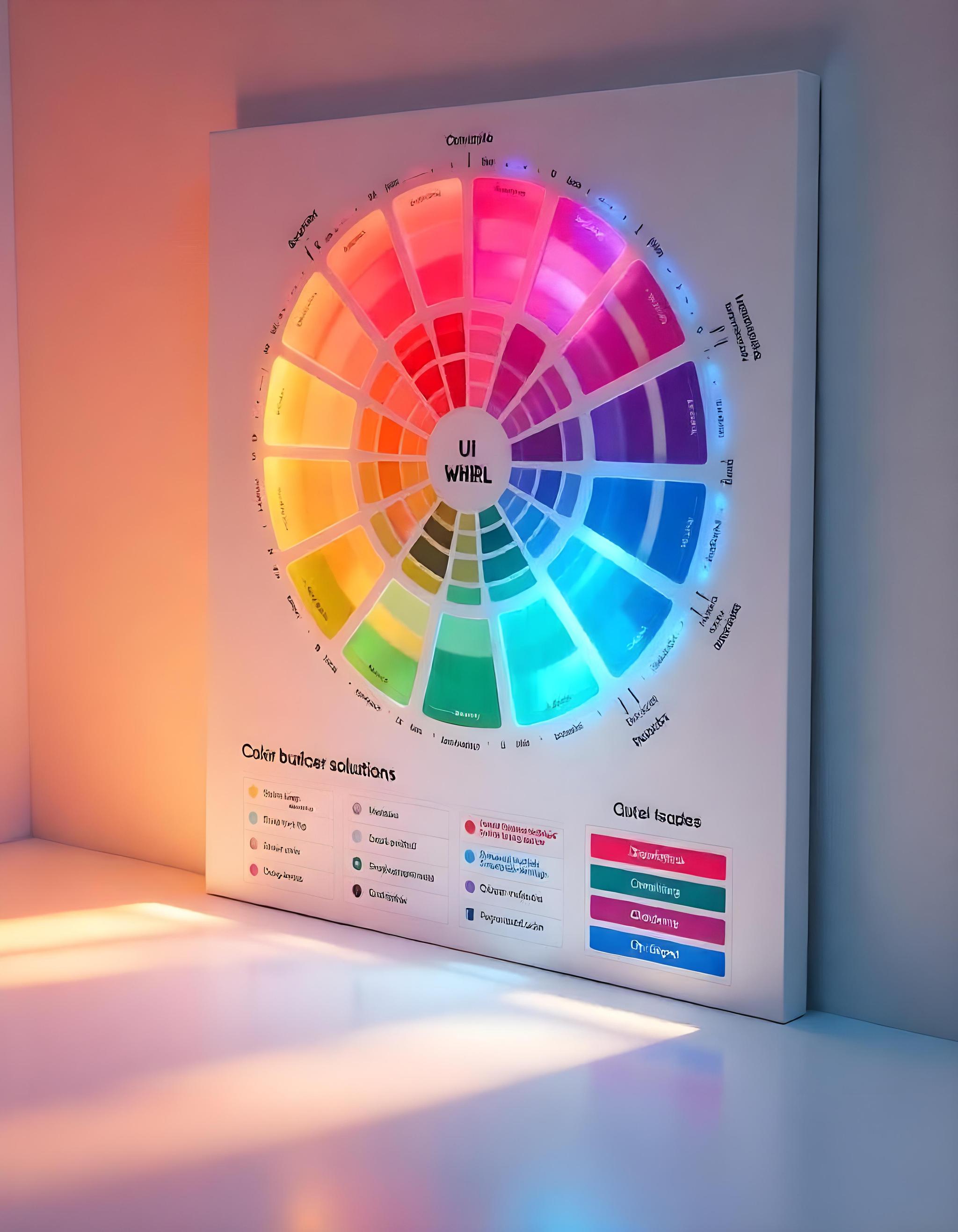
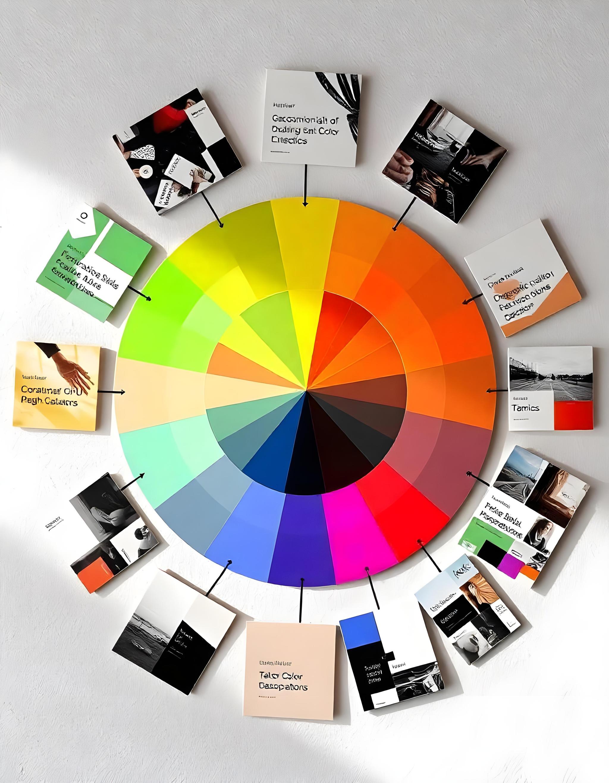
Understanding the relationships between colors is essential. The color wheel provides a foundation for creating harmonious palettes:
- Complementary Colors: Opposites on the wheel (e.g., blue and orange) create contrast.
- Analogous Colors: Neighbors on the wheel (e.g., blue, teal, and green) offer cohesion.
- Triadic Colors: Three evenly spaced colors on the wheel provide balance and vibrancy.
2. The Psychology of Color
Each color carries psychological associations:
- Warm Colors (red, orange, yellow): Energizing and attention-grabbing.
- Cool Colors (blue, green, purple): Calming and professional.
- Neutral Colors (black, white, gray): Versatile and grounding.
Using these associations strategically can enhance user engagement and brand alignment.
3. Accessibility and Inclusivity
Ensure your design is accessible to all users by considering the following:
- Contrast Ratios: Text should stand out against its background (meet WCAG guidelines).
- Colorblind-Friendly Palettes: Avoid relying solely on color to convey information. Use patterns, labels, or shapes as visual aids.

Best Practices for Using Color in UX/UI Design
1. Start with Brand Identity
Your color palette should reflect the brand's personality and mission. For example:
- A playful brand might use vibrant, saturated colors.
- A luxury brand might lean on muted tones and metallic accents.
2. Create a Consistent Color System
Develop a system that defines the following:
- Primary Colors: Used for main branding and key UI elements.
- Secondary Colors: Supportive hues for accents or backgrounds.
- Accent Colors: Highlight interactive elements like buttons or links.
3. Guide Users with Visual Hierarchy
Use color to direct attention:
- Bright, contrasting colors for CTAs (Call-to-Actions).
- Muted tones for secondary information.
- Gradients and shadows to add depth and focus.
4. Test in Real Scenarios
Colors can look different across devices. Test your palette on multiple screens to ensure consistency and effectiveness.
Color in UX/UI design is both an art and a science. By understanding its principles, psychological effects, and practical applications, you can craft designs that resonate with users, communicate your brand, and improve usability. Remember, the ultimate goal is to balance aesthetics with functionality to create intuitive and delightful user experiences.
Frequently Asked Questions
Featureblogs
Relatedblogs
Authorblogs
Get the best of our content straight to your inbox!
By submitting, you agree to our privacy policy.