- Explains why certain colors are globally preferred and how they shape trust and perception.
- Shows how color choices influence decisions in branding, UI, and user actions.
Most Popular Colors and How They Influence Decision
Published on: 27 February 2026
Last updated on: 11 June 2026

Have you noticed how some brands just feel right the moment you see them? You don’t read their story. You don’t analyze their product. You just… trust them. That feeling doesn’t come from luck.
Studies show people form an impression of a brand in just a few seconds, and color plays a major role in that first judgment. Before logic kicks in, your brain has already decided how safe, exciting, or reliable something feels.
Now think about your own product or website. What is your color saying about you?
In this article, we’ll explore the colors people prefer most, why those preferences exist, and how brands use color to influence decisions—often without the user realizing it. No heavy theory. Just simple ideas you can actually use.
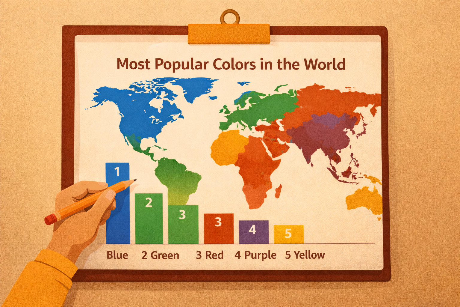
Most popular colors in the world
If you ask people around the world to name their favorite color, one answer keeps winning.
Blue.
Across multiple surveys and regions, blue consistently ranks as the most popular color globally. Countries like the UK, Germany, the United States, Australia, and China all show the same pattern. No matter the culture, blue sits comfortably at the top.
According to global research published by YouGov, blue is repeatedly ranked as the most liked color across different demographics. While preferences may shift slightly from country to country, the overall result stays remarkably stable.
There’s also a clear gender angle.
Men tend to prefer blue more strongly than women. In the US, a significantly higher percentage of men say blue is their favorite color. That detail matters if your product audience skews male, technical, or enterprise-focused.
Now pause for a second.
This helps explain why so many tech platforms, financial tools, and enterprise products rely heavily on blue. They’re not trying to look trendy. They’re trying to feel safe, reliable, and trustworthy before a single word is read.
After blue, other widely liked colors across global studies include:
- Green
- Red
- Purple
- Yellow
The exact order may change depending on culture, age, or personal background, but these colors consistently appear near the top in research.
Color experts at Pantone have long highlighted that color preference is deeply tied to emotion, memory, and environment. It’s not about aesthetics alone. It’s about how people want to feel when they see a brand.
Psychology research published by outlets like Psychology Today supports this idea. People are naturally drawn to colors that reflect comfort, calm, excitement, or balance based on their experiences and emotional needs.
So if your personal favorite isn’t on this list, that’s completely normal.
Color preference isn’t random, but it is personal. And that’s exactly why brands need to be intentional. The colors you choose quietly shape how people perceive you long before they decide to trust you.
Meaning of different colors and why brands care
Colors don’t just decorate a brand. They communicate before words do.
When someone lands on a website or opens an app, their brain reacts to color first. That reaction sets the tone for everything that follows. Trust, excitement, calm, urgency—all of it starts here.
Let’s look at what the most common colors actually signal in real life, not theory books.
Blue: trust, calm, reliability
Blue makes people feel safe.
It lowers stress and creates a sense of control. That’s why blue dominates industries where trust matters more than persuasion.
You see blue everywhere in:
- Technology products
- Banking and finance
- Healthcare platforms
This is also why companies like Facebook and Microsoft rely heavily on blue-based interfaces. They want users to feel stable and confident before interacting with complex systems.
If your brand needs credibility, blue does a lot of the heavy lifting silently.
Green: balance, growth, and stability
Green is strongly linked to nature, renewal, and balance. It also carries a quiet association with money and long-term value.
That’s why green works well for:
- Sustainability-focused brands
- Finance and investment platforms
- Health and wellness products
Green doesn’t rush people. It reassures them.
A well-known example is Starbucks, which uses green to communicate comfort, consistency, and environmental awareness rather than speed or urgency.
Red: urgency, energy, and emotion
Red demands attention.
It increases heart rate slightly and creates a sense of urgency. That’s why it’s commonly used in:
- Sales and discounts
- Food and beverage branding
- Callouts that require fast action
Red is also deeply tied to emotion: passion, love, excitement. This explains its heavy use during Valentine’s Day campaigns and in beauty or fashion advertising.
Brands like Coca-Cola use red to reinforce energy and excitement at every touchpoint.
Yellow: optimism with limits
Yellow feels warm and cheerful. It reminds people of sunlight, creativity, and positivity.
It’s often used for:
- Creative brands
- Youth-focused products
- Friendly, informal messaging
But yellow needs control. Too much of it can feel overwhelming or even stressful. That’s why designers usually use yellow as an accent rather than a dominant color.
Used carefully, yellow adds energy. Used carelessly, it creates noise.
Orange: friendly action
Orange sits between red and yellow. It carries energy, but in a more approachable way.
Orange works well for:
- Food and beverage brands
- Sports and lifestyle products
- Call-to-action buttons
It’s bold without being aggressive. That’s why many designers use orange when they want users to act without feeling pressured.
Purple: luxury and creativity
Purple has long been associated with royalty, imagination, and depth.
You’ll often see purple in:
- Luxury branding
- Beauty and fashion
- Wellness and spiritual products
Purple signals exclusivity and creativity. It’s not meant to be everywhere. When used sparingly, it adds sophistication and mystery.
What this really means for brands
No color is good or bad on its own.
What matters is:
- Who your audience is
- What emotion you want to trigger
- Where the color is used
- How it works with the rest of the palette
Colors don’t convince people.
They prepare people to be convinced.
Why color theory matters in branding and UI/UX
Here’s the mistake many brands make.
They treat color like decoration.
But in reality, color is one of the fastest ways to communicate meaning. Before users read your headline, scan your features, or understand your product, color has already shaped how they feel.
In UI/UX, color guides:
- Where users look first
- What feels clickable
- What feels safe
- What feels urgent
If the colors don’t align with the brand’s message, users feel friction—even if they can’t explain why.
This is why strong brands don’t just “pick a nice color.” They build a color system that supports trust, clarity, and behavior.
The psychology of color preferences
Color preference is emotional before it’s logical. People don’t choose colors because they understand psychology. They choose them because of how those colors make them feel.
Let’s look at the key factors behind that.
Cultural influence on color perception
Colors don’t carry the same meaning everywhere.
For example:
- White often represents purity and simplicity in Western cultures
- In several Eastern cultures, white is associated with mourning
This is why global brands are careful with color usage across regions. A color that feels positive in one market can feel uncomfortable in another.
Design without cultural awareness creates confusion fast.
Emotional responses triggered by colors
Colors create emotional shortcuts.
- Blue tends to calm and reassure
- Green feels balanced and steady
- Red creates urgency and excitement
- Yellow feels optimistic and energetic
These reactions happen automatically. Users don’t stop to think about them. Their brain reacts first, and decisions follow.
That’s why color psychology matters more than personal taste.
Branding decisions backed by psychology
Over time, colors become part of brand memory.
People don’t just remember logos. They remember how a brand made them feel. When color is used consistently, it reinforces that feeling again and again.
This is how brands become recognizable even without names or icons.
Gender differences in color preference
Research often shows patterns in gender-based color preference:
- Men generally respond better to bold, high-contrast colors
- Women often prefer softer, more nuanced tones
This doesn’t mean brands should stereotype. It means designers should test, observe, and adapt based on real audience behavior rather than assumptions.
How colors influence decision-making
Color doesn’t just shape perception. It directly affects action.
Visual attention and first impressions
Bright colors like red and orange naturally draw the eye.
That’s why they’re effective for:
- Call-to-action buttons
- Alerts and notifications
- Limited-time offers
If something is important, color can make sure it’s noticed without extra words.
Brand recognition and trust
Consistency builds familiarity.
When people repeatedly see the same colors used thoughtfully, they start associating those colors with reliability. Over time, that familiarity turns into trust.
That’s one reason inconsistent rebranding often hurts more than it helps.
Emotional triggers and associations
Colors help users decide how to feel.
Warm colors create excitement and momentum.
Cool colors create calm and confidence.
Designers who understand this can guide behavior without pushing users aggressively.
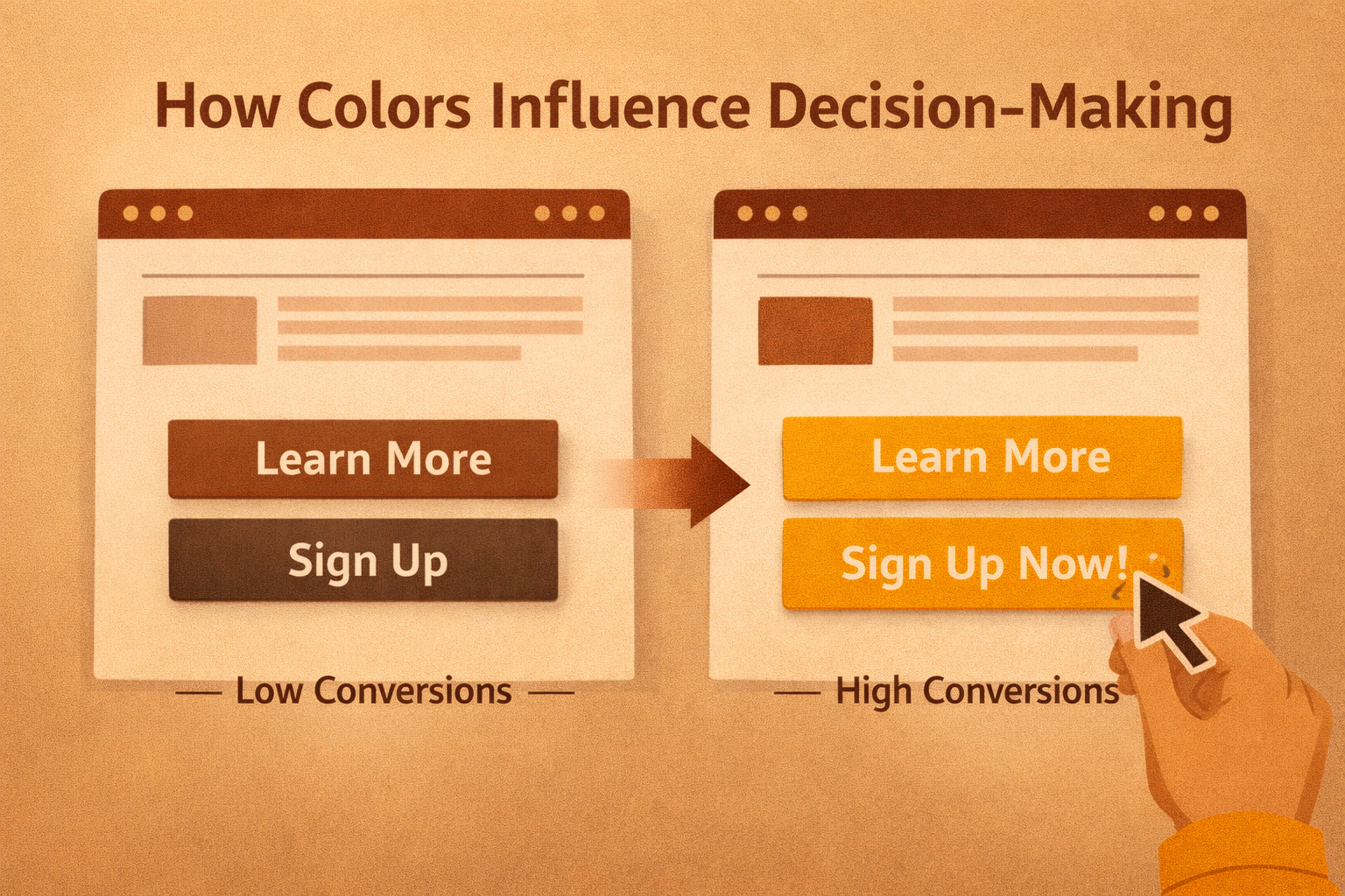
Call-to-action effectiveness
The color of a button can change conversion rates significantly.
Buttons that clearly contrast with the rest of the interface stand out and invite action. This is one of the simplest and most effective ways to improve user engagement.
Mood and overall user experience
Color sets the atmosphere.
Calming tones work well for healthcare, finance, and productivity tools. High-energy colors work better for entertainment, food, and promotions.
When color matches purpose, the experience feels effortless.
Real-world case studies that prove color matters
Instagram’s rebrand
In 2016, Instagram introduced a new logo, moving away from its classic camera design to a colorful gradient.
The reaction wasn’t smooth at first. Many users disliked the change.
But over time, the new look aligned better with Instagram’s evolution into a visual-first, creative platform. It felt modern, expressive, and relevant to a younger audience. Growth continued, and the brand stayed culturally strong.
Short-term resistance. Long-term clarity.
Tropicana’s packaging redesign
In 2009, Tropicana changed its packaging, removing its iconic orange imagery in favor of a minimal design.
Customers didn’t recognize it.
Sales dropped sharply within weeks. The brand quickly reverted to its original look, and sales recovered soon after.
The takeaway was simple: color familiarity builds trust. Remove it suddenly, and people hesitate.
Practical tips for designers and product teams
If you work with UI, UX, or branding, keep these principles in mind:
- Test color choices instead of guessing
- Align colors with brand voice and audience mindset
- Use small changes for A/B testing
- Be cautious with bold colors
- Gather feedback from real users
- Don’t cling to theory if results say otherwise
Color guidelines exist to help you think, not to trap you.
Wrapping up
Color isn’t just design. It’s a strategy. When you understand your audience and the emotions you want to create, color becomes one of your strongest tools. Used intentionally, it builds trust, clarity, and momentum. Used without thought, it creates hesitation even when everything else looks right.
The right colors do more than look good. They shape how people feel, how they navigate, and how confidently they take action. When color choices align with brand messaging and real user behavior, experiences feel natural. Actions feel obvious. Trust builds quietly.
This is where strong UI/UX design makes the real difference. At Mediusware, we design interfaces where color decisions are deliberate, user-focused, and guided by behavior patterns. From individual product flows to complete digital platforms, our UI/UX work helps brands guide decisions clearly and confidently.
If you’re building or refining a digital product, start with one simple question:
What do we want users to feel at every step?
The right colors begin answering that question before a single word is read.

I work with founders and leadership teams when growth moves faster than their systems, teams, or decisions. I’ve led 850+ projects for 750+ clients across 20+ countries, working across 100+ technologies and counting. I care about ownership, clarity, and building things that last beyond the launch.
Featureblogs
Relatedblogs
01
The Role of Psychology in UI/UX Design: How 'Understanding Human Behavior' Shapes Better Experiences02
From Bugs to Beauty: Integrating UI/UX Testing into Software Quality Assurance03
How to Conduct a UX Audit & Its Benefits04
Why We Should Begin Our Design Process with Wireframes?05
Emotional Design in UXAuthorblogs
01
Why Software Companies Are Turning to Strategic Partnerships for Faster Growth02
Your SaaS Isn’t Slow Because of Developers It’s a Scaling Problem03
Why Some SaaS Companies Scale Faster Than Others04
AI vs Hiring: When Should SaaS Teams Automate Instead of Hiring?05
How We Help SaaS Founders Launch Faster