- Primary colors (RGB) are the building blocks of all colors in digital design.
- The RGB model allows designers to create vibrant, dynamic designs for web, UI, and graphics.
- Red, green, and blue evoke specific emotions like urgency, trust, and balance.
- Consistency in RGB colors across devices is key to creating cohesive user experiences.
The Power of Primary Colors in Design
1 min read

Think about the brands you instantly recognize. What’s the first thing that comes to mind? For many, it’s the color. Whether it's the vibrant red of Coca-Cola or the calming blue of IBM, colors are more than just visuals. They're powerful signals that evoke feelings, build trust, and even influence decisions. So,
Why do primary colors matter so much in design?
These three simple colors: red, yellow, and blue, are the foundation of everything you see in design. They go beyond just filling space; they shape how your audience feels about your brand, your product, and even how they interact with it.
In this blog, we’ll explore why primary colors hold such immense power in design, how they influence emotions and brand identity, and how understanding them can transform your visual strategy.
What Are Primary Colors and How Do They Influence?
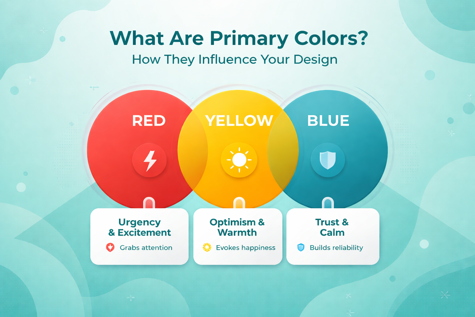
Primary colors red, yellow, and blue are the foundational hues of design. They are the building blocks from which all other colors are derived, but their power doesn’t stop at their appearance. These colors have a profound psychological effect on human perception, influencing emotions, behavior, and even decisions.
Let’s explore these primary colors in detail and see how they impact your design:
-
Red
Red is a color that demands attention. It’s bold, vibrant, and impossible to ignore. When you think of red, think of energy, passion, and action.
- What It Evokes: Red stimulates the nervous system, creating a sense of urgency and excitement. It’s the go-to color for sales promotions, call-to-action buttons, and anything that needs immediate attention.
- Design Impact: Red is powerful when you want to create action and urgency. It's ideal for attention-grabbing designs, like flash sales or limited-time offers. But be cautious, too much red can overwhelm. Balance it with neutral tones to keep it impactful without being aggressive.
-
Yellow
Yellow is the color of sunshine, bright, cheerful, and full of energy. It radiates positivity, making it perfect for designs that want to feel inviting and creative.
- What It Evokes: Yellow triggers feelings of happiness, optimism, and clarity. It sparks creativity and invites people into a warm, positive space.
- Design Impact: Use yellow to create energetic, youthful designs. It’s a fantastic color for brands that want to convey fun or welcoming messages, such as food brands or entertainment. However, use it in moderation; too much yellow can become overwhelming.
-
Blue
Blue is the color of trust, professionalism, and calmness. It’s no surprise that blue is widely used by brands that need to establish credibility and evoke a sense of security.
- What It Evokes: Blue is known for its calming effect. It induces feelings of reliability, peace, and trust, perfect for industries that require customers to feel secure and confident, such as finance, healthcare, and corporate brands.
- Design Impact: Blue is incredibly versatile, ideal for creating professional, trustworthy designs. It works well in corporate settings, in healthcare to promote calmness and security, and in tech for reliability. It pairs well with almost every other color, making it a staple in design.
Color Theory: A Short History
The power of color isn’t a modern discovery. For centuries, colors have played a crucial role in art, design, and human culture. The journey of color theory dates back to ancient times, where early philosophers and scientists tried to understand the nature of colors and their emotional impact.
In ancient Egypt, colors were often used symbolically, green for rebirth, red for life and power, and yellow for the sun. As history progressed, so did our understanding of color, especially with the rise of Greek philosophy, which laid the groundwork for the psychological association of colors.
The Renaissance marked a major turning point when Leonardo da Vinci and other artists began experimenting with the mixing of pigments to create depth, texture, and emotion in their art. This paved the way for modern color theory.
By the 17th century, Sir Isaac Newton revolutionized our understanding of color when he discovered that white light is made up of all colors. He introduced the color wheel, organizing colors in a way that showed their relationships and harmony.
The 19th century saw further exploration, with scientists like Johann Wolfgang von Goethe diving into the psychology of color, analyzing how colors could affect human emotion and behavior. This was the foundation of what we now call color psychology, the study of how different hues influence our mood and decision-making.
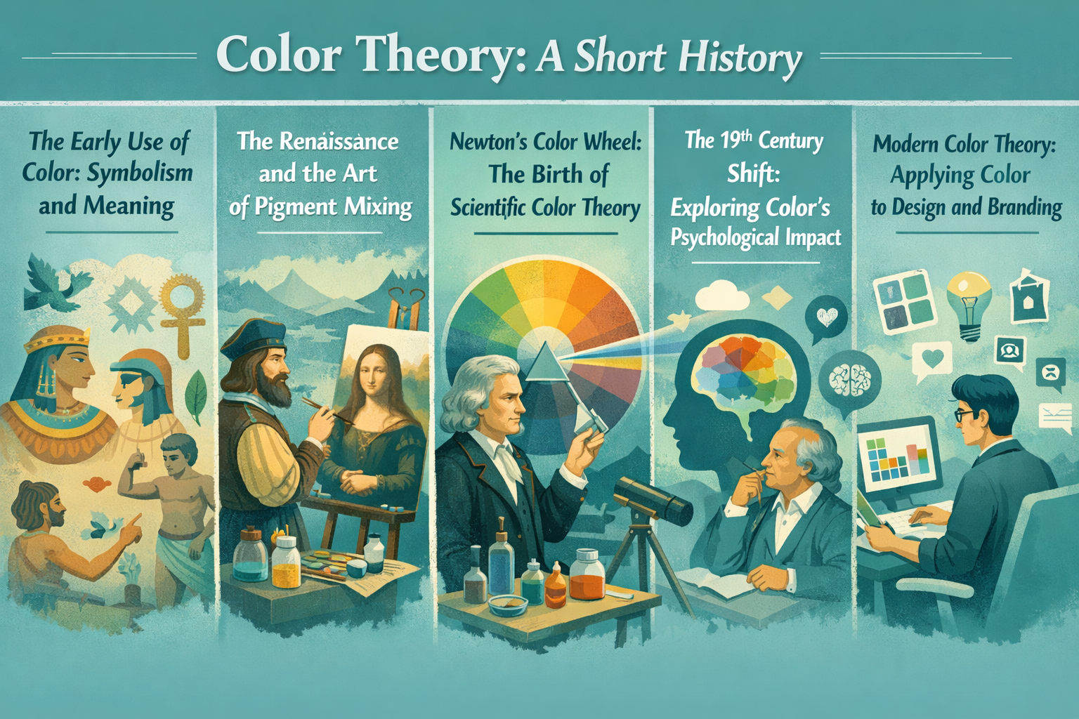
Fast forward to today, and color theory has become an integral part of graphic design, branding, and marketing. The use of primary colors: red, yellow, and blue, remains as relevant as ever, not just for their aesthetic value, but for their emotional impact and ability to influence user behavior.
Color Perception: How the Human Eye Sees Color
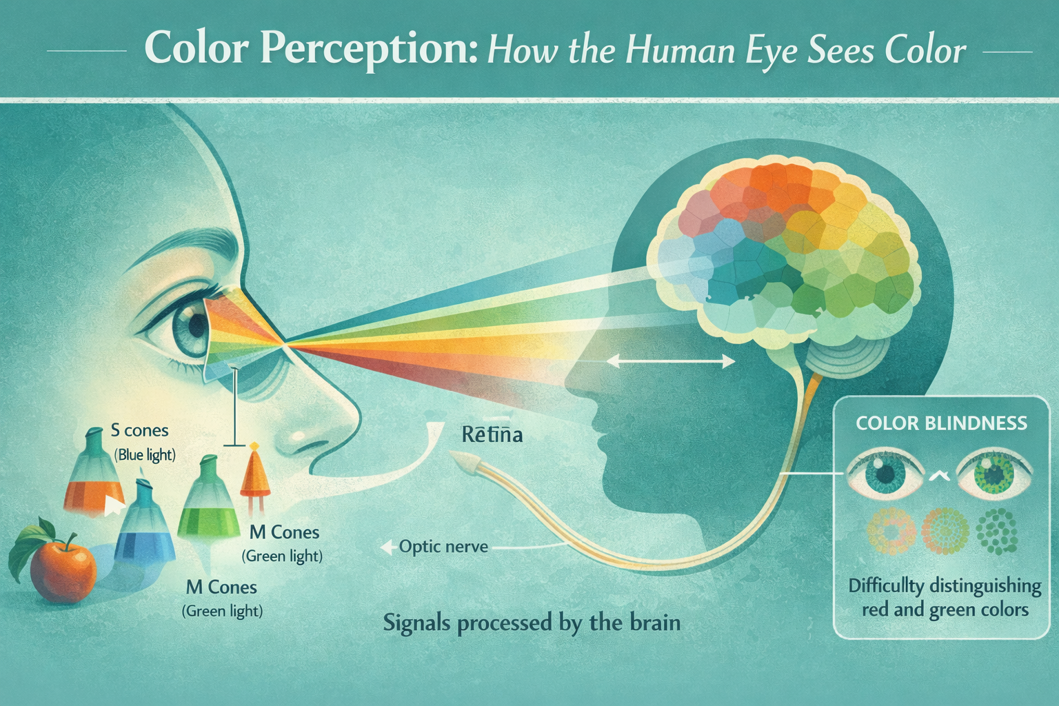
Color perception is a fascinating process that begins in the eye, where specialized cells called cones detect light. These cones respond to different wavelengths of light, allowing us to see a wide range of colors.
The human eye has three types of cones:
- S cones (short) for blue light.
- M cones (medium) for green light.
- L cones (long) for red light.
Light that enters the eye is either absorbed or reflected by objects. The reflected light activates the cones, which send signals to the brain. The brain processes these signals and combines them to create the color we perceive.
Colors are determined by the wavelength of light:
- Red light triggers the L cones.
- Green light triggers the M cones.
- Blue light triggers the S cones.
While most people perceive colors similarly, color blindness occurs when one or more cones are not functioning correctly, making it difficult to distinguish certain colors, such as red and green.
Different Color Models and Their Uses
When it comes to color theory, there isn’t just one model. There are several ways to represent and manipulate colors depending on the medium you’re working with. Whether it's for digital screens, print, or graphic design, each color model has its unique application. Let’s dive into the most widely used models and understand their roles.
1. Additive Color Model: RGB (Red, Green, Blue)
The RGB model is based on the principle of light. It's used in digital screens, including your computer monitor, phone, or television. This model works by mixing red, green, and blue light in different intensities to produce a wide range of colors.
- How It Works: Each pixel in a screen consists of red, green, and blue sub-pixels. By adjusting the intensity of each, the screen creates different colors. When all three colors are at full intensity, the result is white light.
- Use: Primarily used for digital displays like web design, video production, photography, etc., where light emission is the key factor in creating colors.
- Example: Designing a website or app interface? You'll rely on the RGB model to define the colors shown on the screen.
2. Subtractive Color Model: CMYK (Cyan, Magenta, Yellow, Black)
The CMYK model is used for printing, where colors are created by subtracting wavelengths from white light. This model uses cyan, magenta, yellow, and black inks to produce the desired colors.
- How It Works: CMYK operates by combining ink on paper. The more ink you apply, the more light is absorbed, creating darker colors. The colors are subtracted from white light, hence the term subtractive.
- Use: Perfect for print media such as brochures, posters, and business cards—where you need physical pigments to create colors.
- Example: For printing a magazine cover, CMYK would be the model used by printing presses to accurately match colors.
3. HSL and HSV: Hue, Saturation, Lightness/Value
The HSL and HSV models are color spaces used by digital designers and artists. These models break down colors into three components: Hue (color), Saturation (intensity), and Lightness/Value (brightness).
- How They Work:
-
- Hue refers to the actual color (like red, blue, or green).
- Saturation controls the vibrancy of the color.
- Lightness or Value adjusts how light or dark the color is.
- Hue refers to the actual color (like red, blue, or green).
- Use: These models are popular in graphic design and photo editing because they offer a more intuitive way to adjust colors compared to RGB or CMYK.
- Example: When adjusting the color in Photoshop or a vector design tool, you’ll often use the HSL or HSV sliders to fine-tune the color to match your vision.
4. Pantone Color Matching System: PMS
The Pantone system is a standardized color matching system used across industries to ensure colors are consistent across different materials and manufacturers.
- How It Works: Pantone assigns each color a unique code that defines its exact shade. This is especially important in brand identity and packaging, where exact color matching is crucial.
- Use: The Pantone system is used in printing and product manufacturing to guarantee that colors are reproduced consistently across various media.
- Example: A brand like Tiffany & Co. uses a specific Pantone color (Tiffany Blue) in all of its products and branding to maintain a consistent identity.
5. CIELAB: The Device-Independent Model
The CIELAB model is a more advanced, device-independent model developed by the International Commission on Illumination (CIE). It is designed to represent all the colors visible to the human eye and is not dependent on devices like printers or screens.
- How It Works: The CIELAB model uses three dimensions:
- L (lightness), ranging from black to white.
- A (green to red).
- B (blue to yellow).
- Use: It’s used in high-end graphic design, digital photography, and color correction to ensure colors appear consistently across different devices and mediums.
- Example: Professional photographers use CIELAB to adjust images for color accuracy across different digital devices and print mediums.
How Primary Colors Shape Digital Design
In digital design, the primary colors, red, green, and blue, are fundamental in creating all the colors we see on digital screens. The RGB color model is an additive system, where different combinations of these three colors mix to produce virtually every color visible on computers, smartphones, and televisions. By adjusting the brightness of each primary color, designers gain the flexibility to craft distinct color palettes tailored to specific purposes and audiences.
The RGB Model: Building Colors from the Basics
The RGB model relies on three primary colors, red, green, and blue, to form all the other colors visible on digital displays. Additive color mixing means that light is added in varying intensities to create colors. For instance, when all three colors are at full intensity, the result is pure white light. When none of the colors are active, it’s black.
- How It Works: Pixels on a screen consist of sub-pixels that light up in red, green, or blue. Adjusting their brightness allows designers to create various color combinations. For example, a pixel composed of only red and green will produce yellow, while adding blue can create purple.
- Why It Matters: This flexibility is what makes RGB ideal for digital design, allowing for vibrant colors that can be fine-tuned to fit the needs of the design.
Applications of RGB in Digital Design
Web Design
In web design, RGB values or hexadecimal codes are crucial for ensuring color consistency across different browsers and devices. Web-safe colors are a set of colors that appear consistently across platforms, which is why RGB is used for defining colors in websites and web applications.
- Pro Tip: Use RGB values to ensure that colors look the same on various devices, whether it's a laptop, phone, or tablet.
Graphic Design
Graphic designers use the RGB model to craft dynamic visuals for everything from branding to advertising. By adjusting the RGB values, designers can make vibrant, eye-catching images and artwork.
- Real-Life Example: In designing advertisements, RGB allows for a wide range of colors, ensuring the ad stands out in a crowded space.
User Interface (UI) Design
In UI design, color plays a critical role in creating a user-friendly interface. The RGB model is used to balance the aesthetic appeal with functional clarity, ensuring that users can navigate and interact with the interface effortlessly.
Real-Life Example: When designing a mobile app, RGB is used to create high contrast between text and background, making it easier for users to read and interact with buttons.
Challenges in Digital Color Design
Although RGB offers flexibility, there are a few challenges that designers need to account for:
- Color Variability Across Devices: Colors may look different across various devices due to screen resolution, brightness, and color accuracy.
- Solution: Use color management tools and color profiles to ensure that your design looks consistent across various screens.
Best Practices for Using Primary Colors in Digital Design
Here are some best practices to help you use primary colors effectively in your designs:
- Balance and Moderation: While RGB allows for vibrant colors, it's important not to overdo it. Too much intensity in one color can be overwhelming. Try to balance colors for a harmonious design.
- Contrast and Visibility: Make sure there's enough contrast between text and background colors. High contrast makes text legible and improves overall usability.
- Consistency: Use the same RGB values throughout the design to create a consistent and professional look.
Why Primary Colors Are Essential in Digital Design
- Foundation of All Colors: Primary colors (RGB) are the basis for every other color on a digital screen. Understanding how to manipulate these colors allows designers to create dynamic color schemes.
- Brand Identity: Primary colors help establish a strong brand identity. By choosing specific colors that align with the brand’s values and message, designers can create memorable and recognizable brands.
- Improves User Experience: Using primary colors strategically enhances the user experience by making websites or apps easy to navigate and visually appealing.
- Influences Emotions and Perception: Colors influence how users feel when interacting with a design. For example, blue conveys trust, while red generates excitement and urgency.
- Consistency Across Platforms: Primary colors ensure brand consistency across multiple devices and platforms, offering a seamless user experience no matter where the design is viewed.
Conclusion: Unlocking the Power of Primary Colors
Primary colors are the foundation of every vibrant, dynamic digital design. They play a crucial role in shaping user experience, enhancing brand identity, and evoking emotional connections. Whether you're working on web design, app interfaces, or graphic design, understanding how to use the RGB model effectively will elevate your design to create impactful, memorable experiences.
If you're looking to build a strong, consistent brand or need assistance with color strategy in your digital designs, Mediusware specializes in branding services that incorporate color psychology to make your brand stand out. Explore our branding services here, and let us help you create designs that not only look good but resonate with your audience and enhance your brand identity.
Frequently Asked Questions
In digital design, primary colors refer to red, green, and blue (RGB). These colors are the foundation of the RGB color model, used to create every other color seen on screens, including websites, apps, and digital artwork.

I work with founders and leadership teams when growth moves faster than their systems, teams, or decisions. I’ve led 850+ projects for 750+ clients across 20+ countries, working across 100+ technologies and counting. I care about ownership, clarity, and building things that last beyond the launch.
Featureblogs
01
Top 8 Python GUI Frameworks for Developers02
The 12 Most Powerful LLMs: Powering Tomorrow’s Tech Landscape03
C# vs. Java: Key Differences, Advantages, and Future Prospects04
Why Software Companies Are Turning to Strategic Partnerships for Faster Growth05
Haptic Feedback: Why Touch is Becoming the Most Powerful Experience in Tech01
Top 8 Python GUI Frameworks for Developers02
The 12 Most Powerful LLMs: Powering Tomorrow’s Tech Landscape03
C# vs. Java: Key Differences, Advantages, and Future Prospects04
Why Software Companies Are Turning to Strategic Partnerships for Faster Growth05
Haptic Feedback: Why Touch is Becoming the Most Powerful Experience in TechRelatedblogs
01
The Role of Psychology in UI/UX Design: How 'Understanding Human Behavior' Shapes Better Experiences02
From Bugs to Beauty: Integrating UI/UX Testing into Software Quality Assurance03
How to Conduct a UX Audit & Its Benefits04
Why We Should Begin Our Design Process with Wireframes?05
Emotional Design in UXAuthorblogs
01
Building a Financial SaaS Around Real Business Cash Decisions02
Critical PHP Security Update (October 2026): What SaaS Owners Must Check Now03
SaaS MVP Development: A Founder’s Guide for 202704
Zero Clicks, Falling Traffic: How to Win Back Revenue05
Ranking on Google in 2026: What Matters in the Age of AI Search