- Explains how secondary colors shape clarity, emotion, and visual flow in design.
- Shows practical ways to apply secondary colors across UI, branding, and layouts.
What Are Secondary Colors? How to Use Them in Design?
1 min read
Have you ever looked at a design and felt unsure why it didn’t click, even though everything looked right? The layout was clean. The typography made sense. The spacing felt balanced. And yet, something felt off.
You didn’t trust it. You didn’t stay. You definitely didn’t take action.
Here’s the uncomfortable truth most teams miss:
Color choices, especially secondary colors, quietly decide how confident a design feels.
Most people treat secondary colors as fillers. Something added at the end to “make it look nicer.” That’s where designs start to fall apart. Because when secondary colors aren’t intentional, users feel confusion before they can explain it. And if you’re designing a website, landing page, product interface, or brand system, confusion is expensive.
I’ve seen products with strong ideas fail simply because their color system worked against them. I’ve also seen average products win trust fast because their visual language felt calm, clear, and deliberate. That difference isn’t luck. It’s control.
In this guide, we’ll break down how secondary colors actually work in real design systems, where they help, where they hurt, and how to use them without making your design feel noisy or forced. Let’s get into it.
What Are Secondary Colors in Design?
Secondary colors aren’t just the result of mixing two primary colors. In design, they play a much more practical role: they support decisions without demanding attention.
Think about a SaaS dashboard.
The primary color might be blue. It sets the brand tone. But the success state? That’s green. The warning? Orange. The inactive state? A muted purple or gray-green. None of these are accidental. They’re secondary colors doing quiet, important work.
Here’s a simple way to understand it:
- Primary colors establish identity
- Secondary colors create clarity, flow, and emotional balance
Without secondary colors, interfaces feel flat or overwhelming. With them, users know where to look and what to do next without thinking.
A Simple Color Breakdown
| Color Type | Role in Design | Real Example |
| Primary | Brand recognition | Header background, main buttons |
| Secondary | Guidance & contrast | CTAs, alerts, highlights |
| Neutral | Stability | Backgrounds, text |
This is why strong brands rarely rely on a single color. They build systems.
Why Designers Rely on Secondary Colors
Secondary colors help designers solve three core problems:
- Hierarchy – what matters most vs what supports it
- Emotion – calm vs urgency, trust vs excitement
- Usability – clarity without overload
As Don Norman, cognitive scientist and UX pioneer, puts it:
Good design is actually a lot harder to notice than poor design, in part because good designs fit our needs so well that the design is invisible.
Secondary colors are a big reason that invisibility works.
A Quick Comparison: With vs Without Secondary Colors
| Without Secondary Colors | With Secondary Colors |
| Everything competes | Clear visual hierarchy |
| Actions feel unclear | Actions feel obvious |
| Design feels unfinished | Design feels intentional |
If you’ve ever wondered why some designs feel “mature” and others feel rushed, this is usually the gap.
For deeper design systems and color psychology research, resources like Nielsen Norman Group and Google’s Material Design guidelines consistently emphasize controlled secondary color usage as a core usability principle.
How Secondary Colors Are Created? Why Does the Ratio Changes Everything?
Most people think secondary colors are fixed. Orange is orange. Green is green. Purple is purple.
That assumption causes a lot of design mistakes.
In reality, the ratio between the two primary colors completely changes how a secondary color feels and behaves in a design.
Let’s break it down in a way that actually matters for designers.
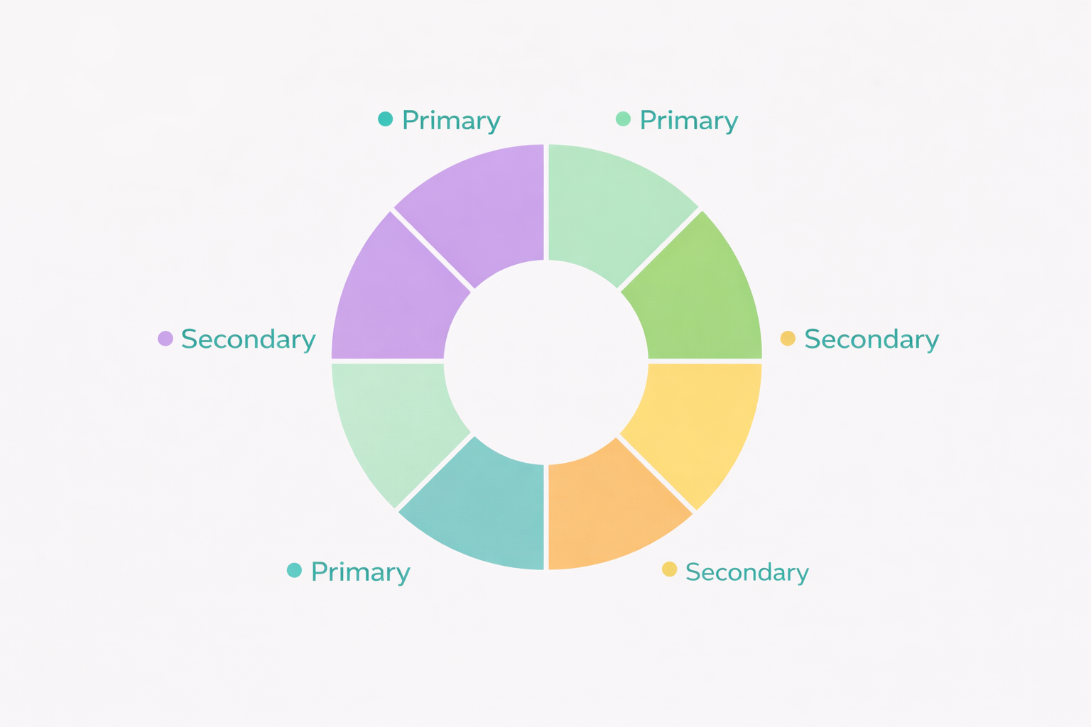
The Three Core Secondary Colors
| Primary Mix | Secondary Color | What Designers Should Know |
| Red + Yellow | Orange | Controls urgency vs friendliness |
| Yellow + Blue | Green | Balances energy and calm |
| Red + Blue | Purple | Shifts between boldness and depth |
But the real power comes from how much of each color you use.
Orange: Energy With Control
Orange is a mix of red’s urgency and yellow’s optimism.
- More red → feels urgent, aggressive, action-driven
- More yellow → feels friendly, inviting, accessible
This is why many checkout buttons use softer oranges instead of pure red. You get attention without pressure.
Green: Calm That Still Moves
Green blends yellow’s brightness with blue’s stability.
- More yellow → energetic, fresh, youthful
- More blue → calm, trustworthy, professional
This is why fintech apps often use blue-leaning greens, while wellness brands lean toward yellow-green tones.
Same color family. Very different emotional outcome.
Purple: Depth Without Distance
Purple combines red’s intensity with blue’s logic.
- More red → expressive, creative, bold
- More blue → thoughtful, premium, composed
This is why purple works so well for brands that want to signal creativity without losing credibility.
Why This Matters in Real Design Systems
Here’s the thing most teams overlook:
Users don’t react to color names.
They react to temperature, weight, and contrast.
A green success state can feel:
- Reassuring
- Neutral
- Or even stressful
All depending on the mix.
Design systems that feel polished aren’t using more colors. They’re using better ratios.
Common Mistake to Avoid
Many designers:
- Pick secondary colors from a palette tool
- Apply them everywhere at full strength
That’s how designs become loud.
Strong systems instead:
- Adjust saturation and warmth
- Use secondary colors sparingly
- Let them support, not compete
This is where amateur design turns professional.
Why Secondary Colors Matter More Than You Think
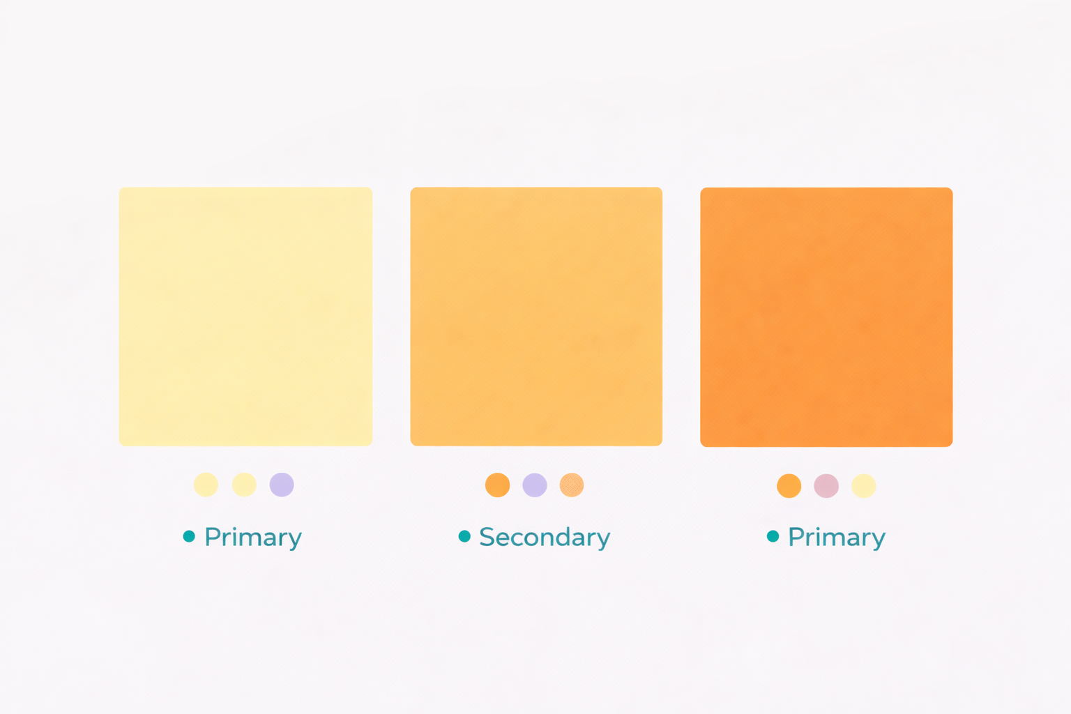
Secondary colors fill the emotional gaps primary colors leave behind.
They:
- Create hierarchy without shouting
- Reduce cognitive load
- Make interfaces feel intentional
When designers skip this step, they compensate with:
- More icons
- More text
- More visual noise
That’s backwards.
Strong color systems simplify. Weak ones clutter.
Importance of Secondary Colors in Design
1. Visual Contrast and Readability
Secondary colors help text and actions stand out without harsh contrast. This improves scanning, accessibility, and comprehension.
2. Emotional Control
Orange blends urgency and optimism.
Green blends calm and movement.
Purple blends creativity and trust.
That blend is why secondary colors feel human instead of extreme.
3. Depth Without Complexity
Primary-only palettes feel flat. Secondary colors add layers without chaos.
4. Brand Recognition
Primary colors attract attention.
Secondary colors build familiarity.
Most brands are remembered because of the full system, not one hero color.
5. Cohesion in Complex Layouts
Secondary colors help different sections feel connected, especially in long pages and dashboards.
6. Visual Flow
Subtle secondary tones guide the eye naturally. Users move without friction.
Uses of Secondary Colors
Web & UI Design
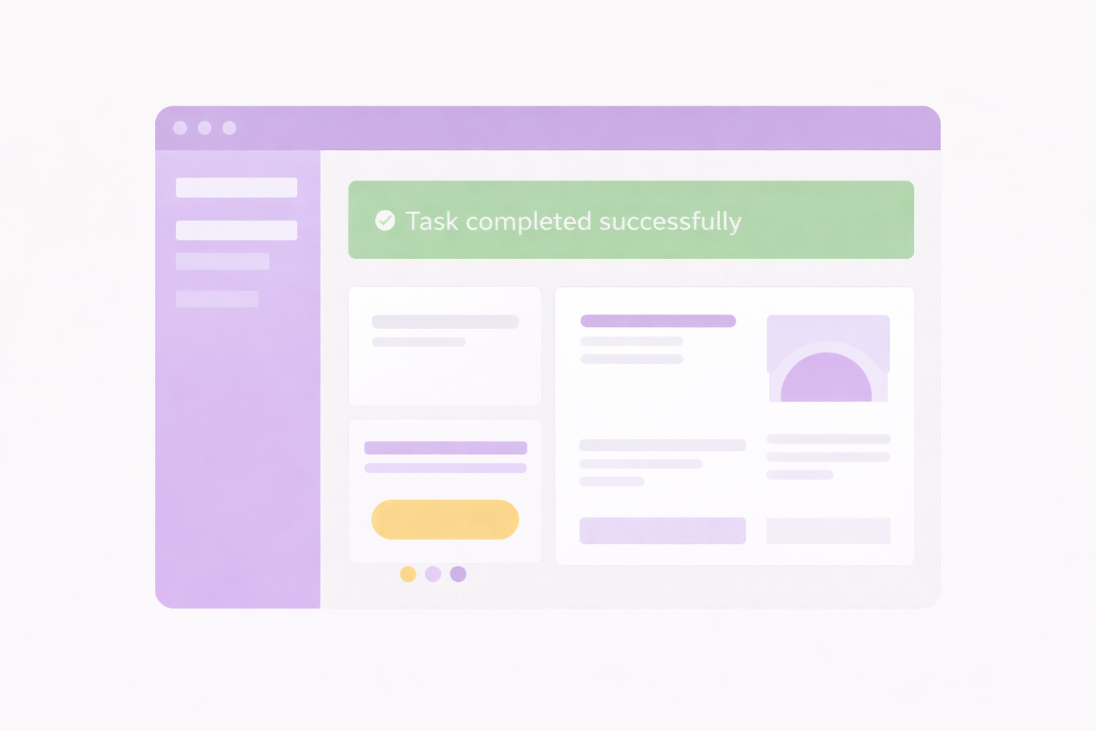
Secondary colors guide:
- CTAs
- Hover states
- Success and error messages
They reduce hesitation and increase confidence.
Branding
They allow consistency across:
- Social media
- Ads
- Presentations
Without repeating the same look everywhere.
Packaging
A single secondary accent can:
- Differentiate on shelves
- Signal benefits
- Improve recall
Interior Design
Green calms spaces. Orange energizes them. Purple adds character.
Secondary colors fine-tune atmosphere.
RGB vs CMYK: Why Colors Look Different Everywhere
This is where many designs break.
RGB (Digital)
- Light-based
- Brighter and more vibrant
- Used for screens
Common mixes:
- Red + Green = Yellow
- Red + Blue = Magenta
- Blue + Green = Cyan
CMYK (Print)
- Pigment-based
- Absorbs light
- Requires testing
Common mixes:
- Cyan + Yellow = Green
- Magenta + Yellow = Red
- Cyan + Magenta = Blue
A color that looks perfect on screen can look dull in print. Professionals always test both.
How to Use Secondary Colors Effectively in Design
Follow the 60–30–10 Rule
- 60% neutral
- 30% primary
- 10% secondary
Simple. Proven. Reliable.
Design for Accessibility
Secondary colors help create contrast where primary colors fail. This matters for usability and inclusivity.
Use Color With Intent
Ask one question:
What should the user feel here?
Let that answer choose the color.
Guide Attention, Don’t Force It
Secondary colors work best when they guide, not demand.
Test in Context
Colors behave differently depending on:
- Screen
- Lighting
- Content density
Always test with real layouts.
The Future of Secondary Colors in Design
Design trends are moving toward:
- Muted secondary palettes
- Accessibility-first contrast
- Fewer colors, stronger intent
- System-driven color usage
The future isn’t louder color.
It’s smarter color.
Final Thoughts
Secondary colors aren’t decoration. They’re structure.
They decide:
- Whether a design feels polished
- Whether users trust it
- Whether actions feel obvious or forced
The best designs don’t show off color. They use it quietly and deliberately.
If you want your work to feel intentional, stop asking what looks good.
Start asking what helps the user move forward.
That’s where secondary colors earn their place.
Frequently Asked Questions
Secondary colors are colors created by mixing two primary colors. In design, they are used to add contrast, balance, and visual clarity without overpowering the main brand color.

I work with founders and leadership teams when growth moves faster than their systems, teams, or decisions. I’ve led 850+ projects for 750+ clients across 20+ countries, working across 100+ technologies and counting. I care about ownership, clarity, and building things that last beyond the launch.
Featureblogs
Relatedblogs
01
The Role of Psychology in UI/UX Design: How 'Understanding Human Behavior' Shapes Better Experiences02
From Bugs to Beauty: Integrating UI/UX Testing into Software Quality Assurance03
How to Conduct a UX Audit & Its Benefits04
Why We Should Begin Our Design Process with Wireframes?05
Emotional Design in UXAuthorblogs
01
Critical PHP Security Update (October 2026): What SaaS Owners Must Check Now02
SaaS MVP Development: A Founder’s Guide for 202703
Zero Clicks, Falling Traffic: How to Win Back Revenue04
Ranking on Google in 2026: What Matters in the Age of AI Search05
How to Choose an API Development Company for Your SaaS Product