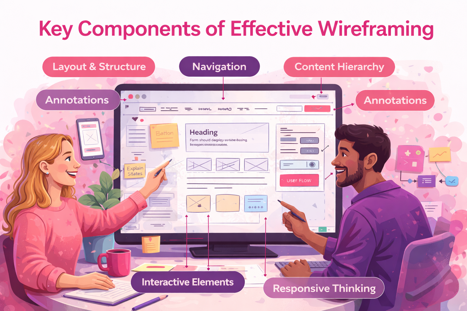
Strong wireframes aren’t about artistry. They’re about clarity. Here’s what actually matters.
1. Layout & Structure
Defines how information is organized and scanned. A good layout guides attention without explanation.
2. Navigation
Menus, links, and paths between screens. If users can’t move intuitively, visuals won’t save it.
3. Content Hierarchy
What’s primary vs secondary?
This answers: What should users notice first?
4. Interactive Elements
Buttons, forms, toggles, states. Even static wireframes should show intent.
5. Annotations
Short notes explaining behavior or decisions. This is where wireframes become a communication tool, not just a sketch.
6. Responsive Thinking
Desktop, tablet, mobile. Wireframes should adapt, not just resize.
7. User Flow
How users complete real tasks, not ideal ones. This is where usability problems reveal themselves early.
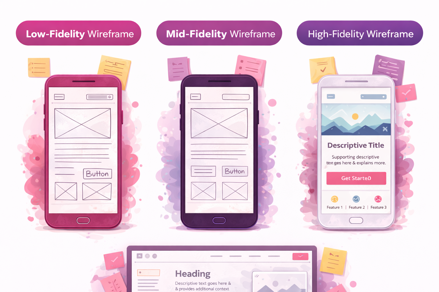
According to Jakob Nielsen,
Usability issues found early cost a fraction of what they do post-development. Wireframes are one of the cheapest ways to surface them.